Certosa District, Brand design
Client:
Jamestown, real estate agency (Italy).
Jamestown, real estate agency (Italy).
Briefing:
Design of the brand identity for the new Milanese district Certosa.
Design of the brand identity for the new Milanese district Certosa.
Creative fields:
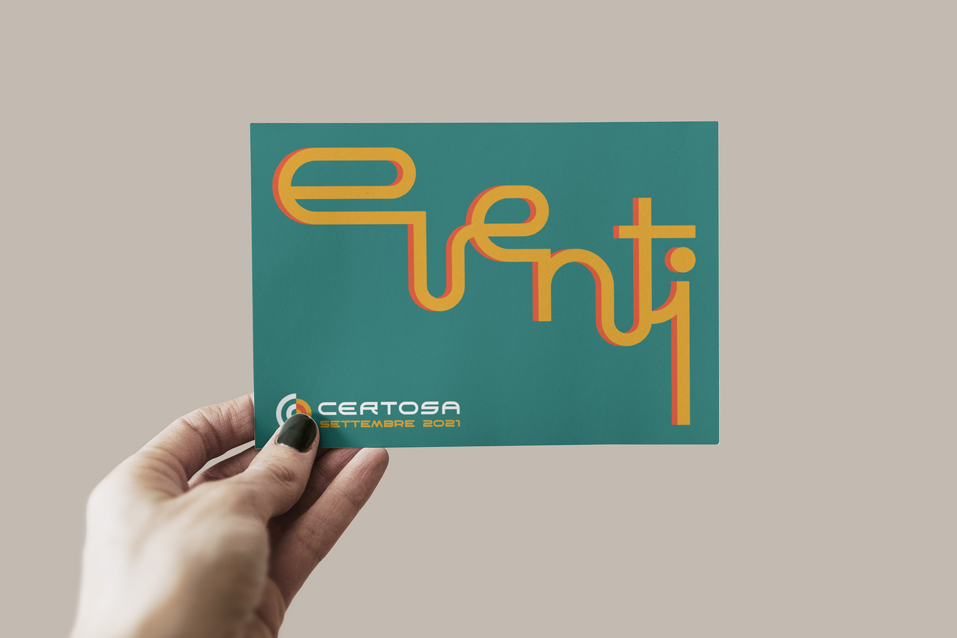
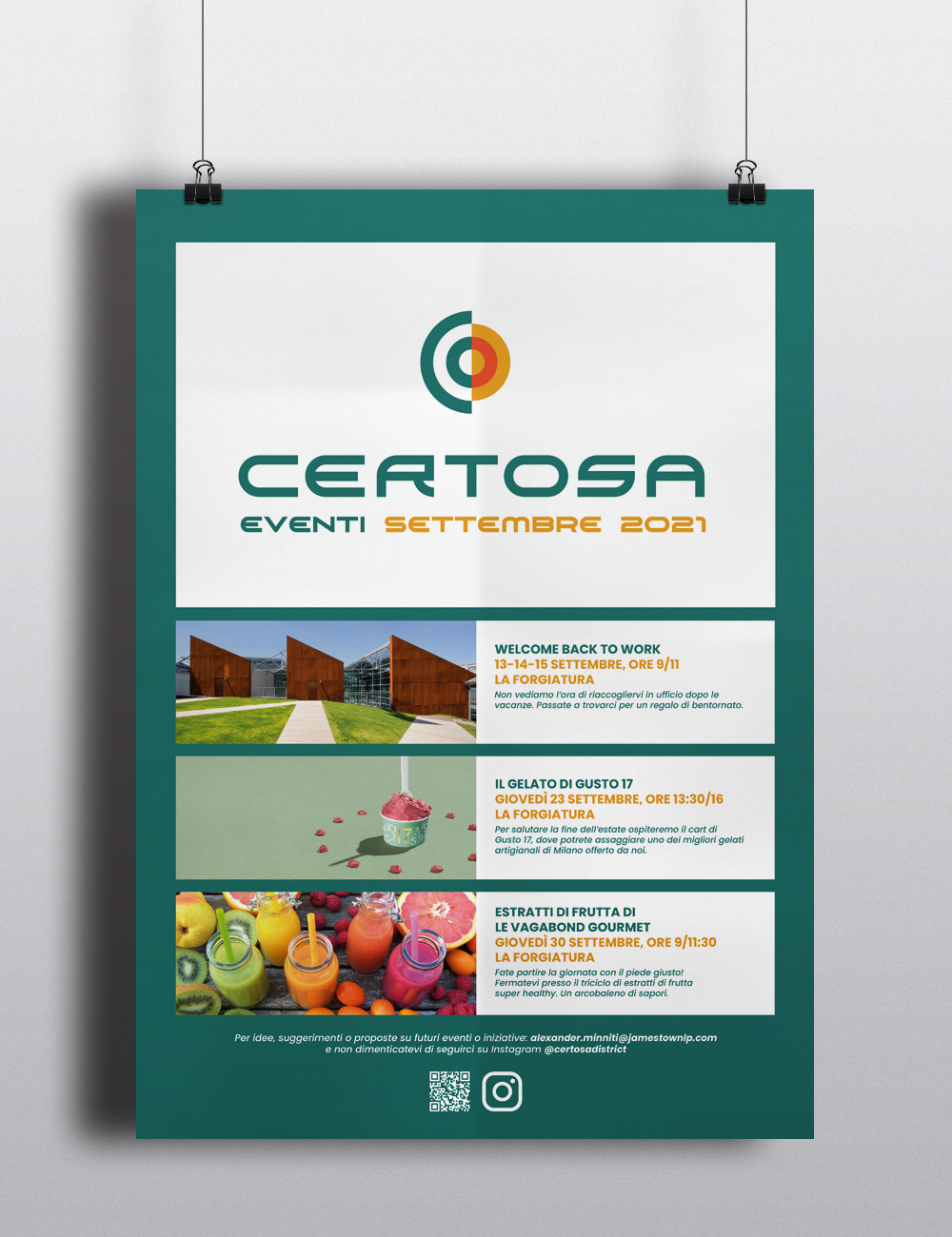
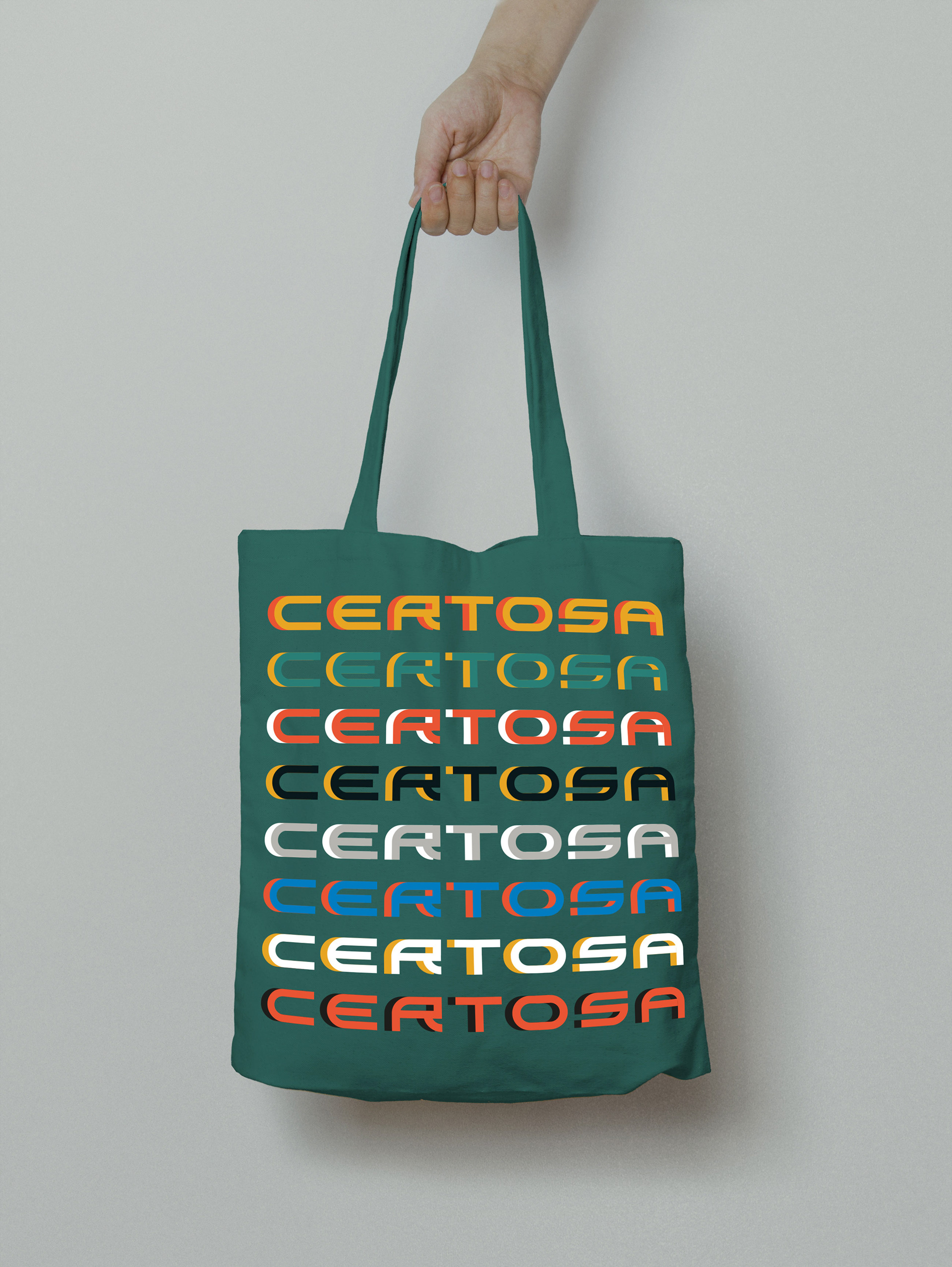
Logo design, typography, pattern design, postcard, posters, guidelines.
Logo design, typography, pattern design, postcard, posters, guidelines.
-------------
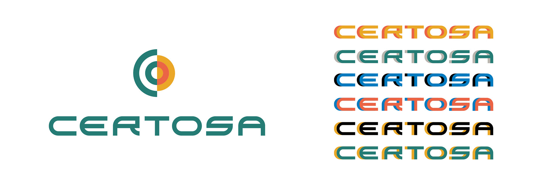
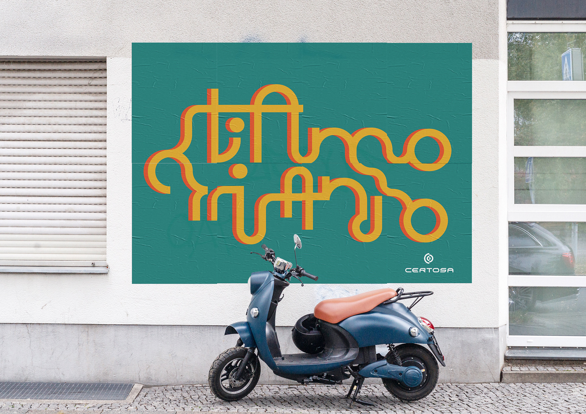
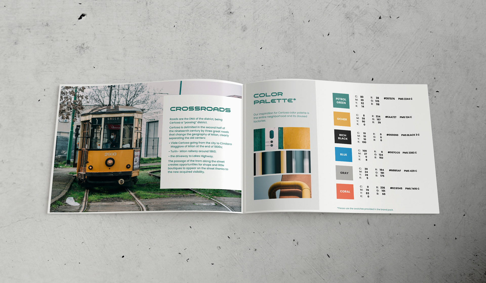
This neighbourhood used to host metallurgic factories which are now being converted into cultural hotspots. I knew this district from my childhood as a “quartiere di passaggio” (a passing district) since Certosa is delimited by three big roads that lead in&out the city of Milan.
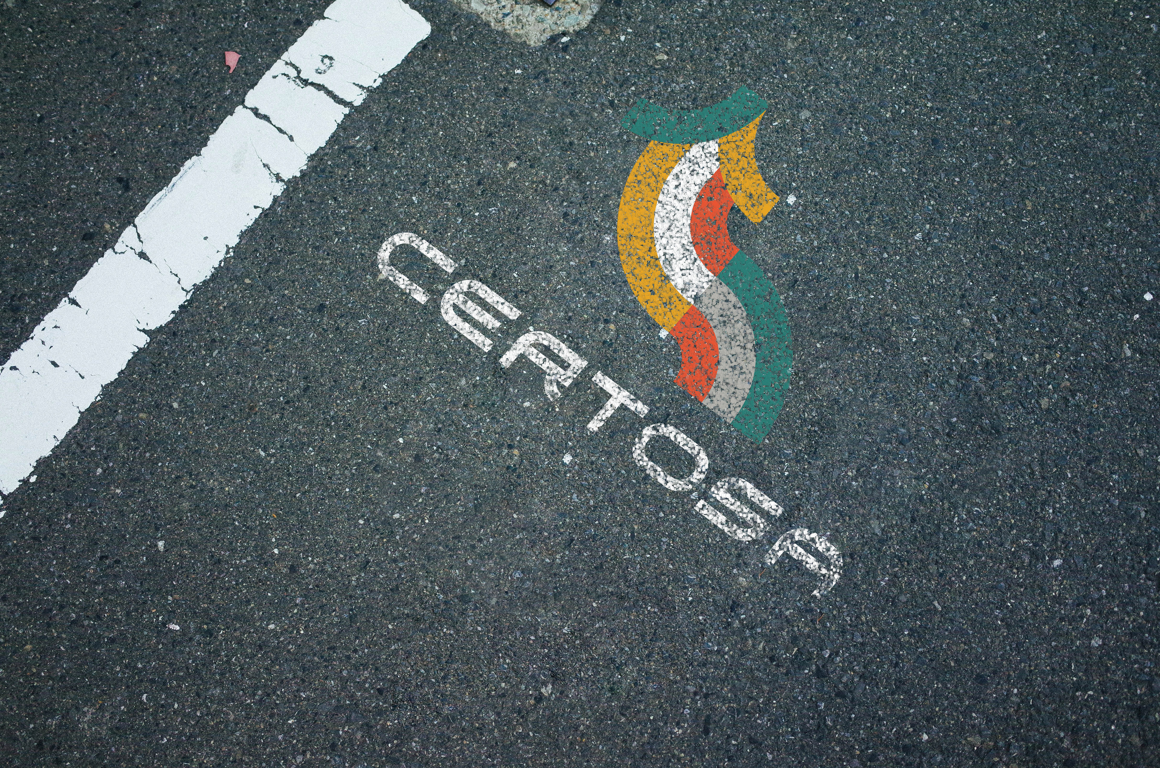
The central theme of “roads” has been the inspiration for this logo: a ‘C’ and a ‘D’ built on circles, interlacing each other. The colour palette takes inspiration from the colours of the neighbourhood reinforcing the industrial vintage look & feel. The lines become protagonist also in patterns and custom-made typography.