RoCvA, Signage & Environmental design
Client:
RoC van Amsterdam, post-secondary college (the Netherlands).
RoC van Amsterdam, post-secondary college (the Netherlands).
Briefing:
Design of a new tone of voice for all the signages and spaces of the institute.
Design of a new tone of voice for all the signages and spaces of the institute.
Creative fields:
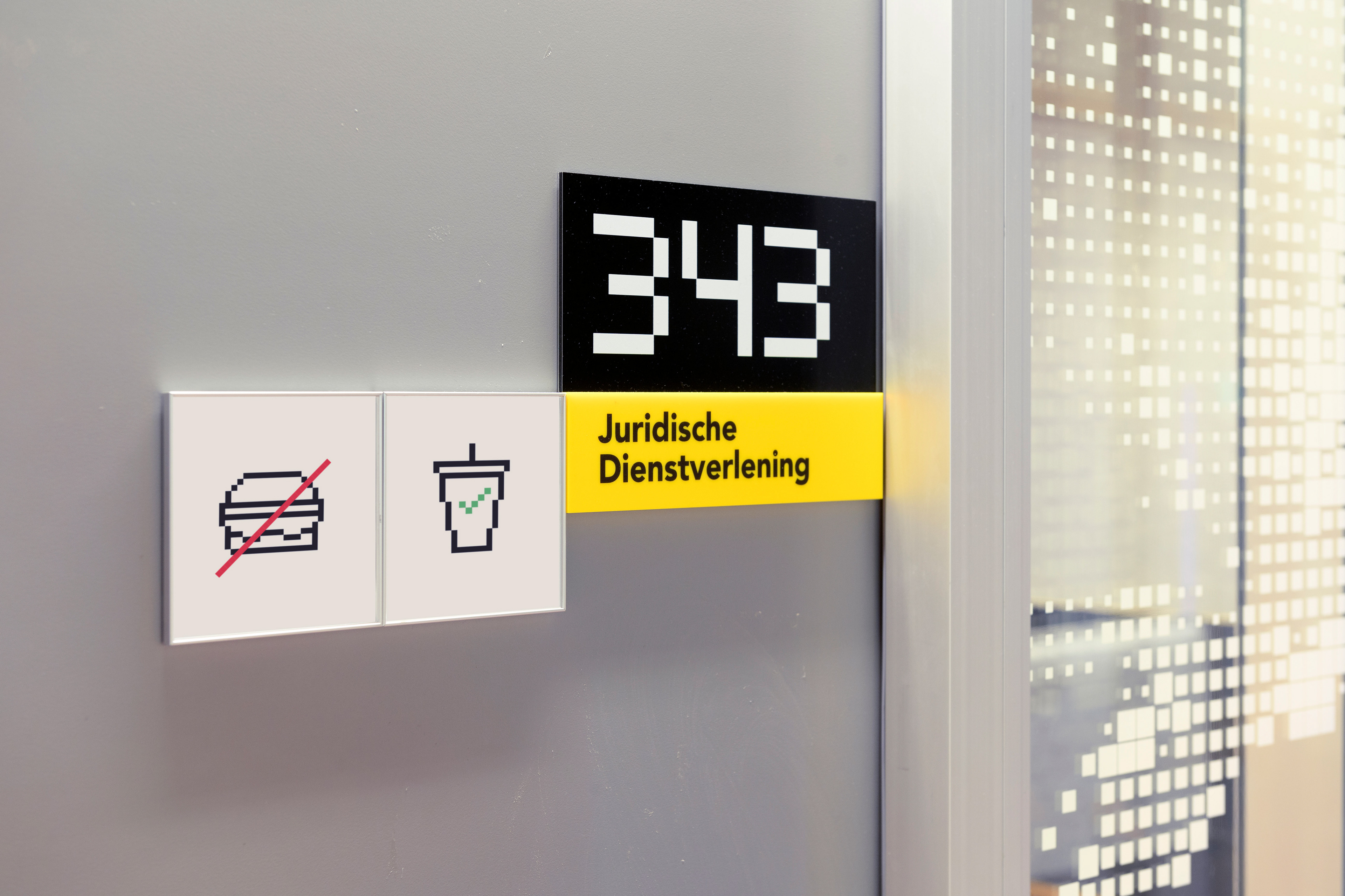
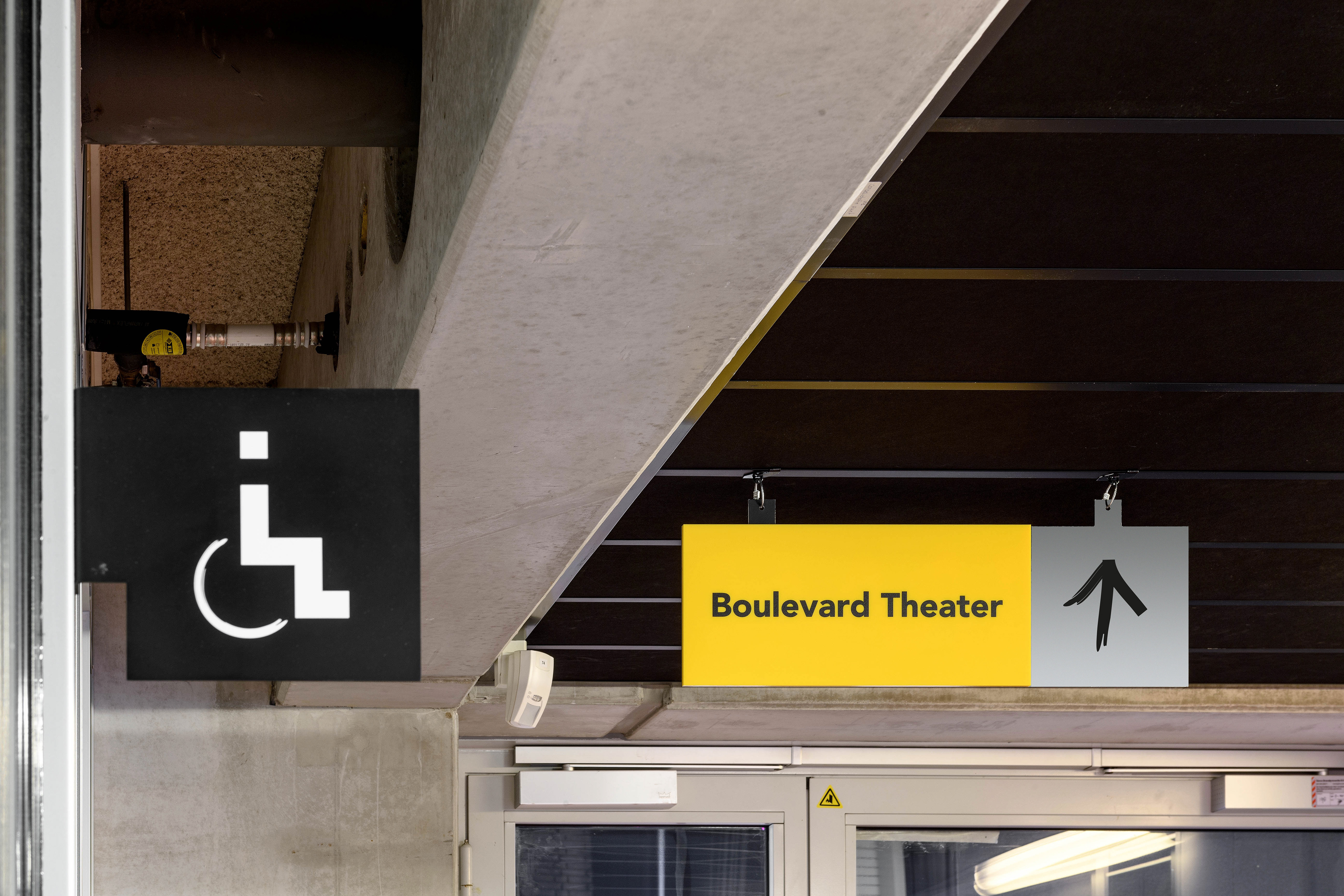
Pattern design, typography, signage design, environmental graphic.
Pattern design, typography, signage design, environmental graphic.
In partnership with:
VEVS (interior design), Sarah Napier (graphics), HDV Signmakers (production), Mike Bink (photography).
VEVS (interior design), Sarah Napier (graphics), HDV Signmakers (production), Mike Bink (photography).
-----------
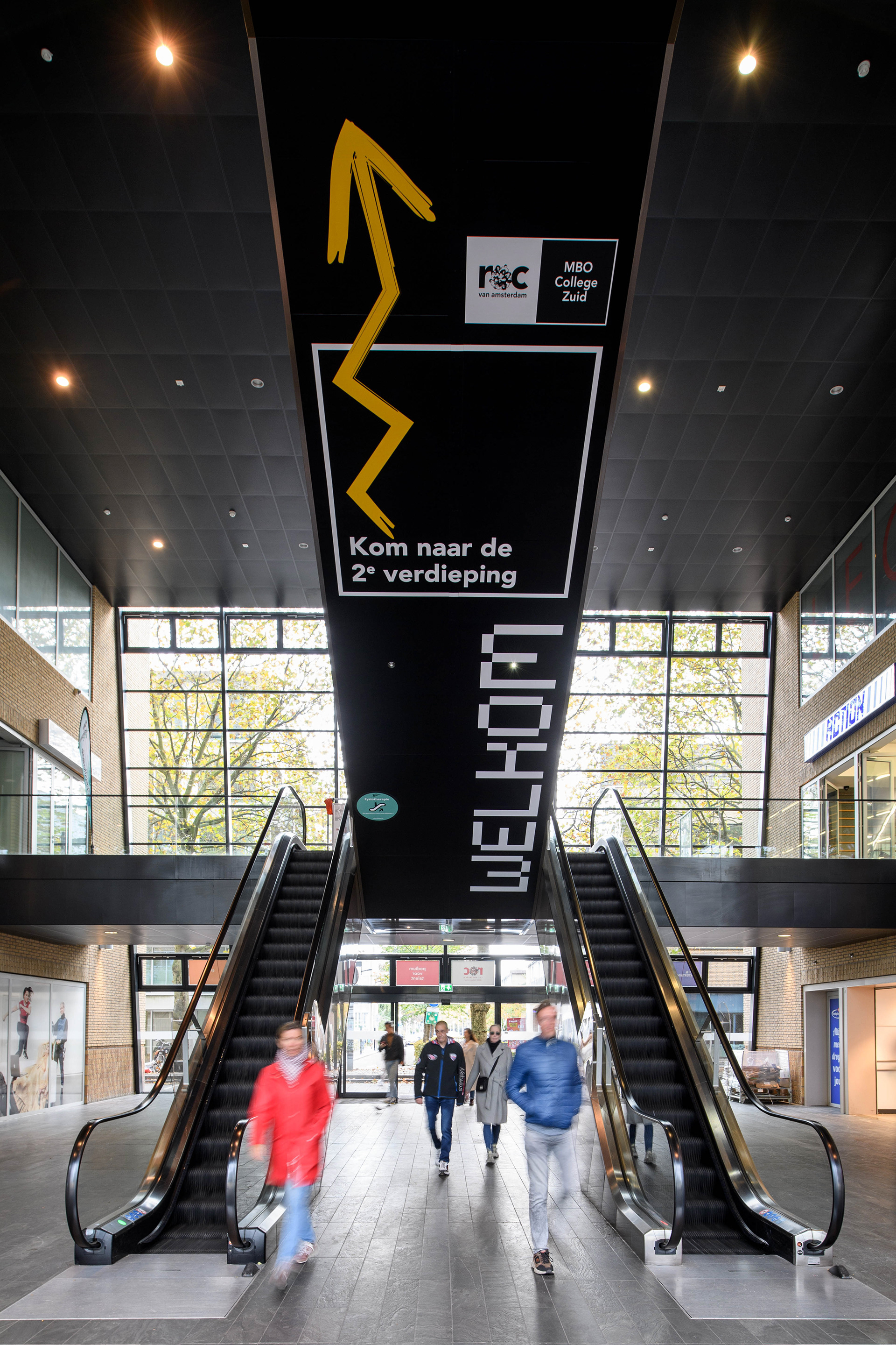
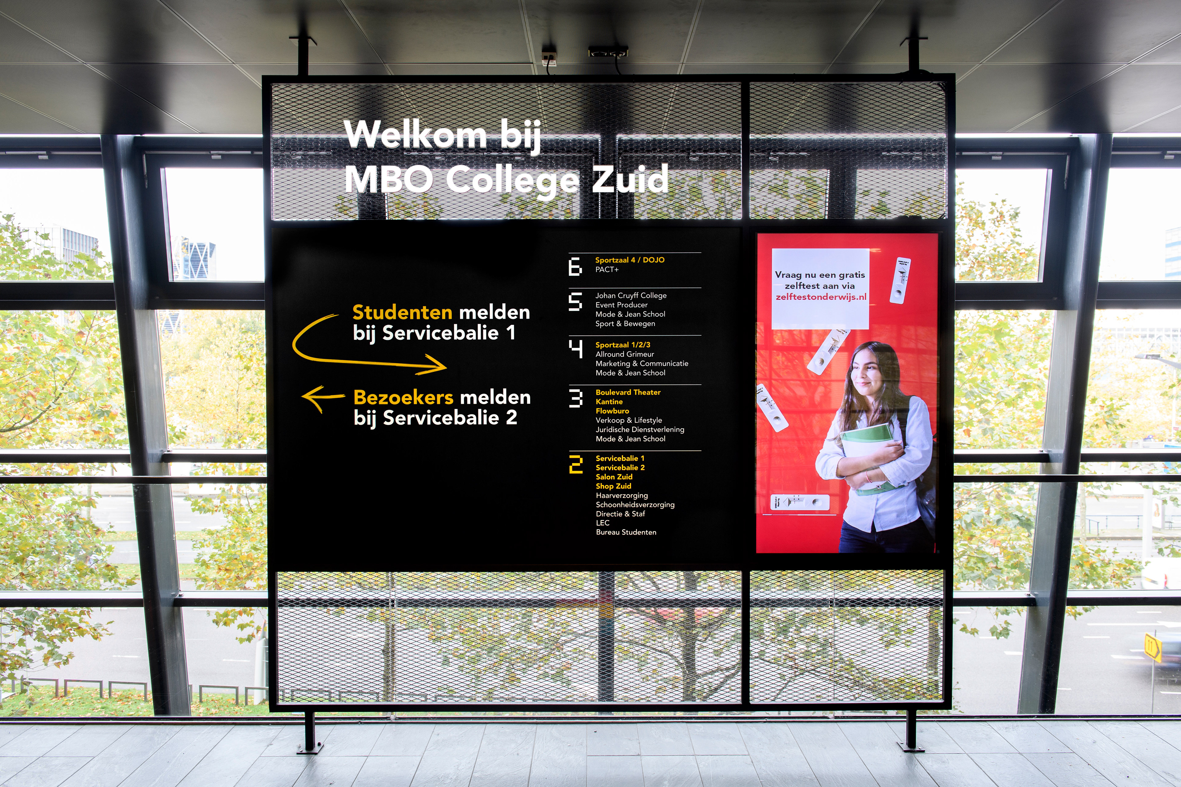
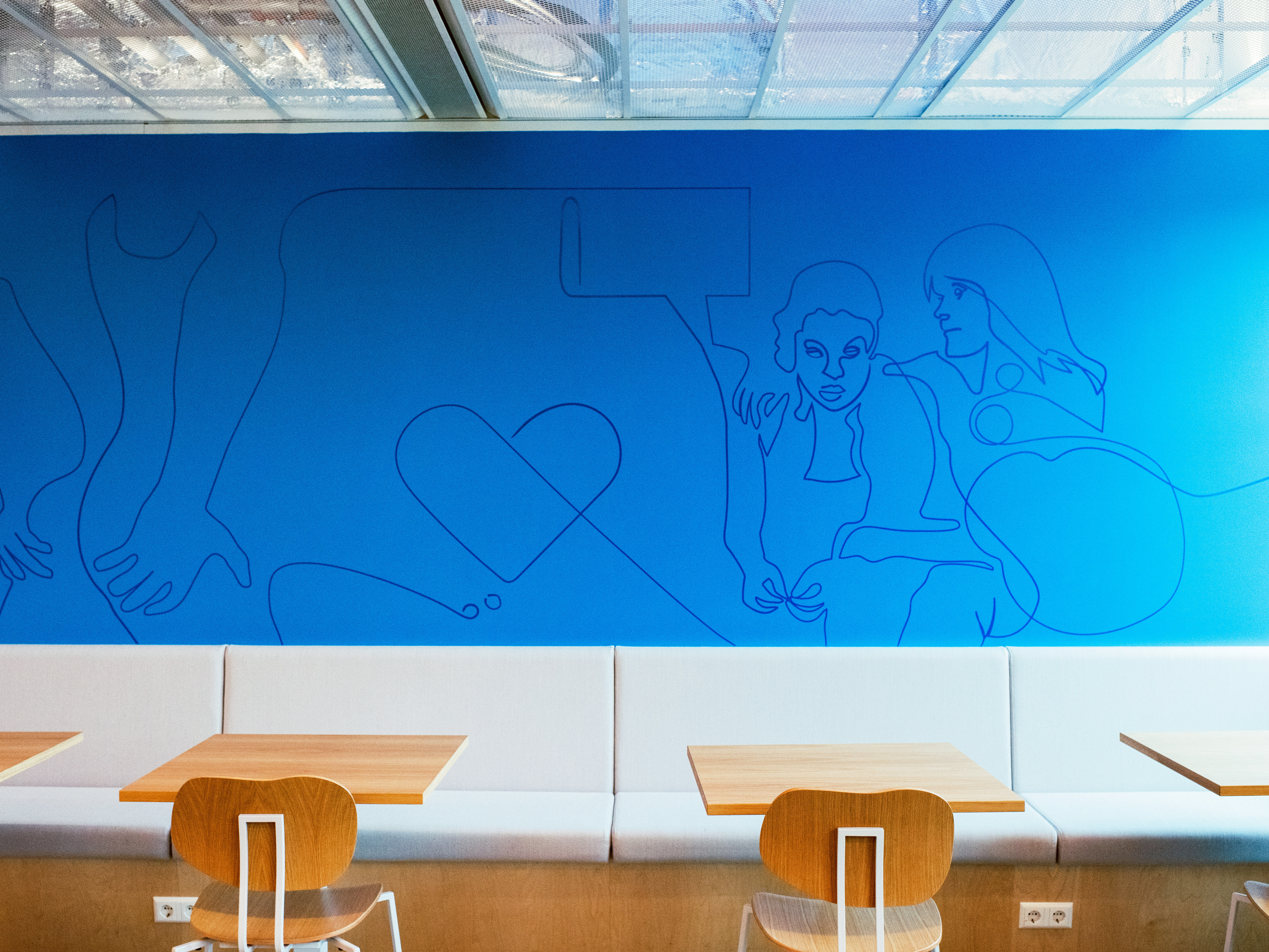
The RoC building situated opposite the RAI in Amsterdam was in need of a make-over, from both an interior and a graphic point of view. The building itself was complex, being sort-of split in half and thus being a labyrinth of staircases and classrooms not always logically divided according to departments.
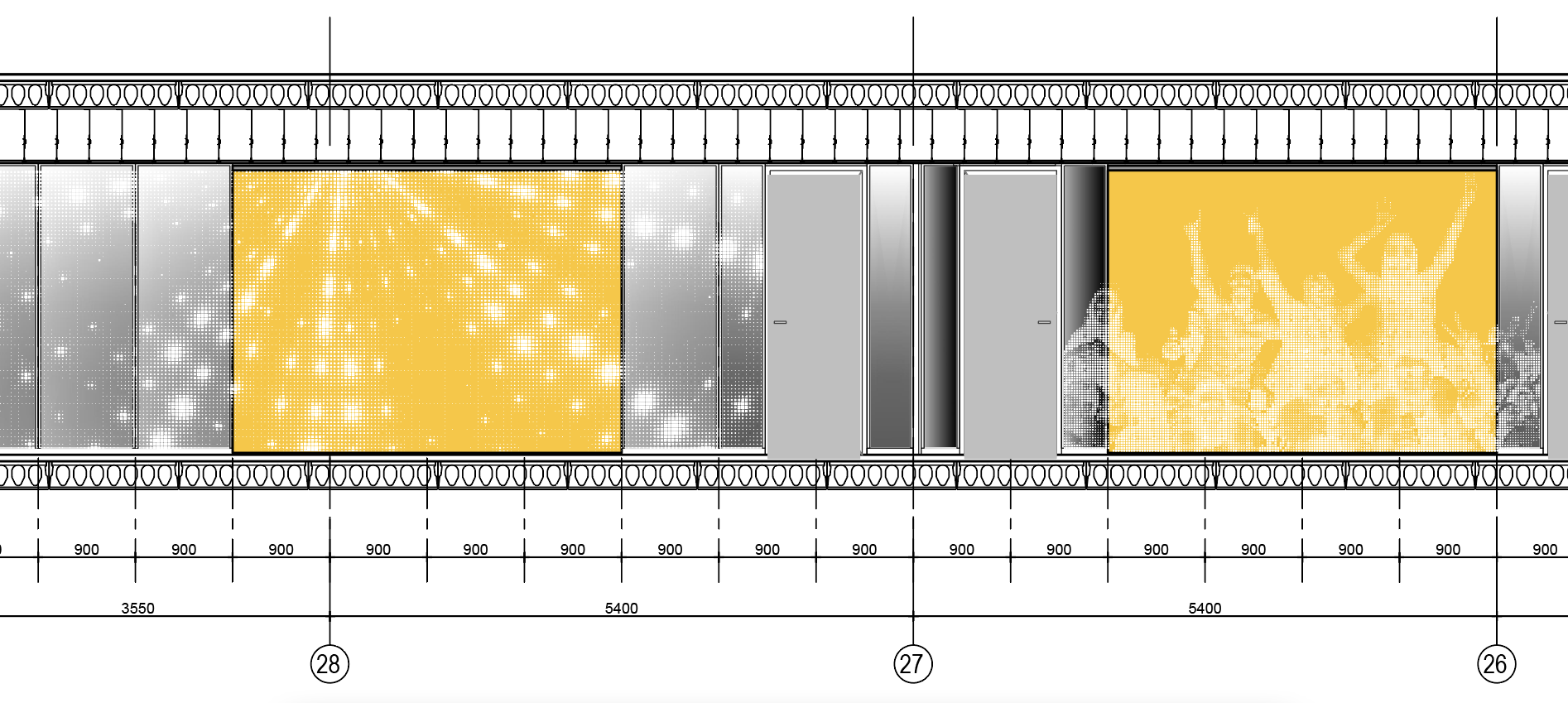
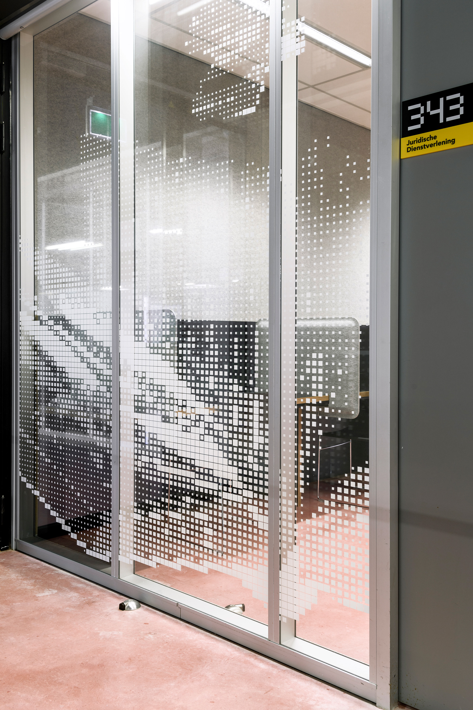
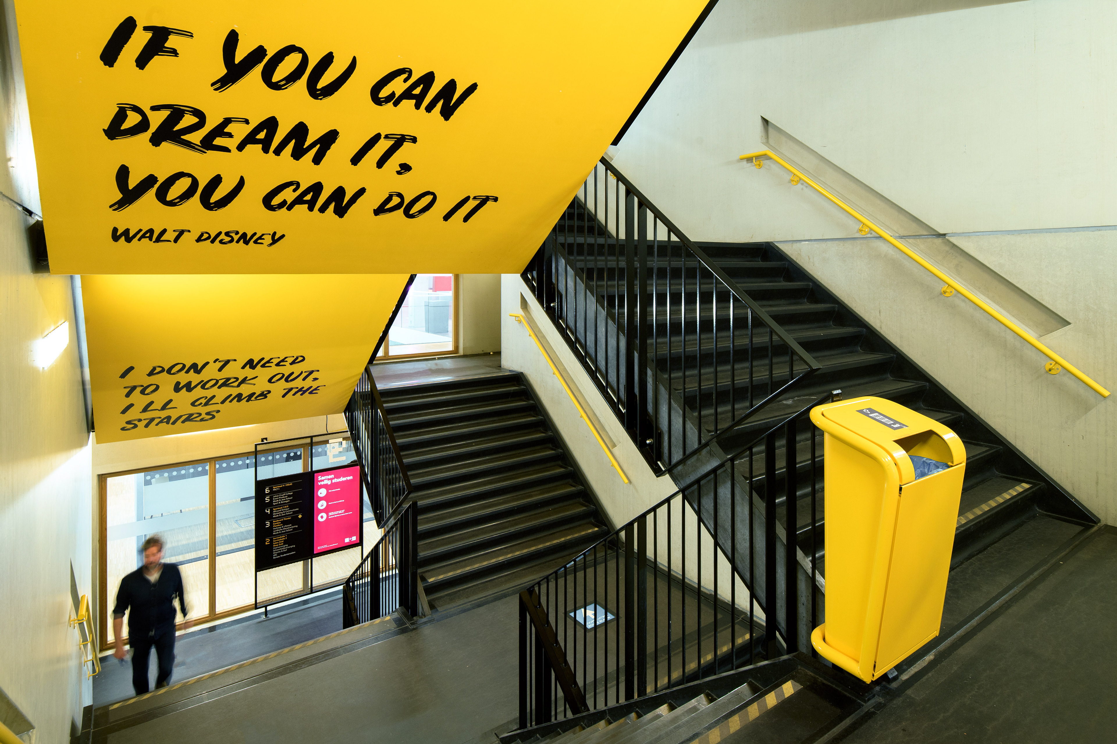
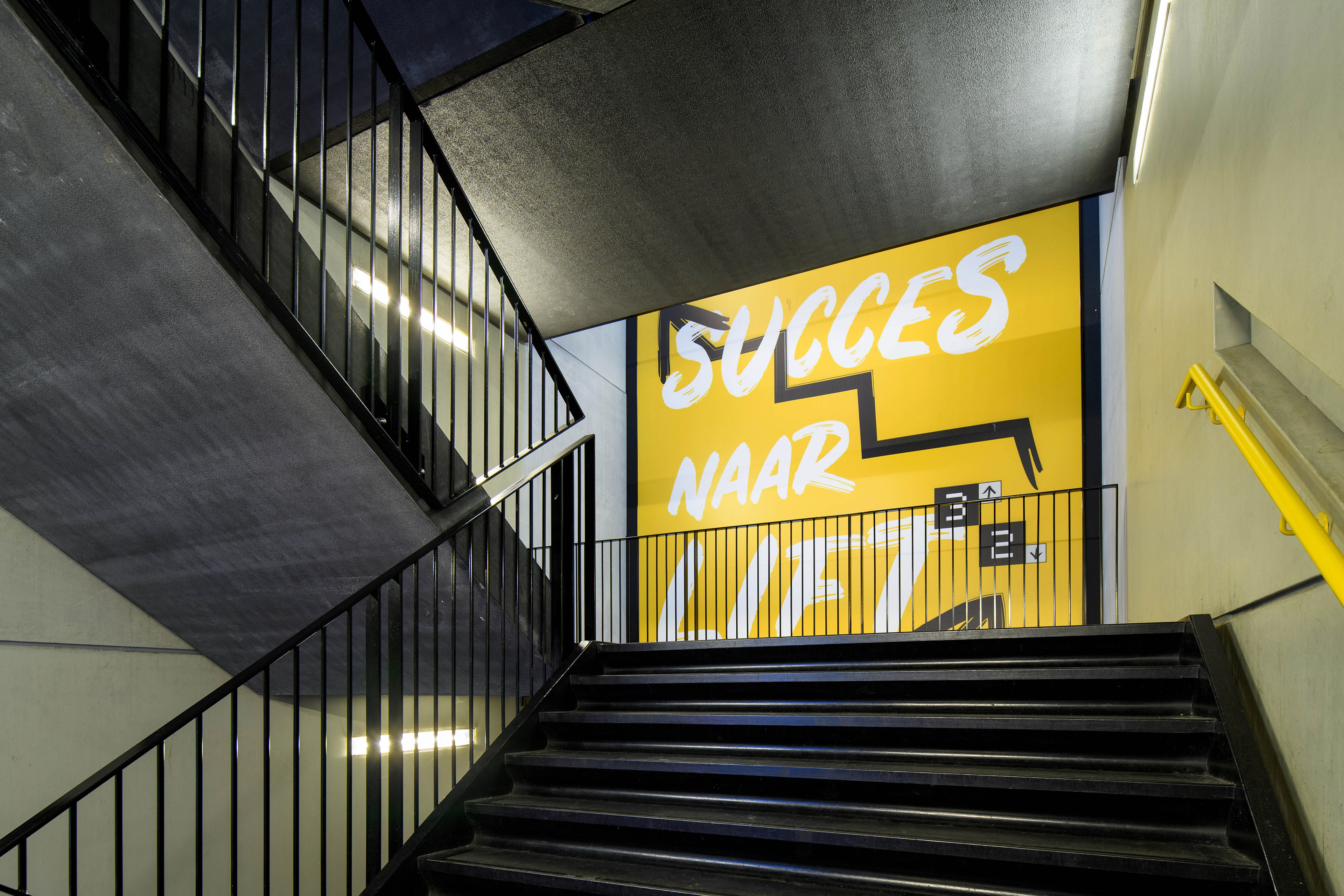
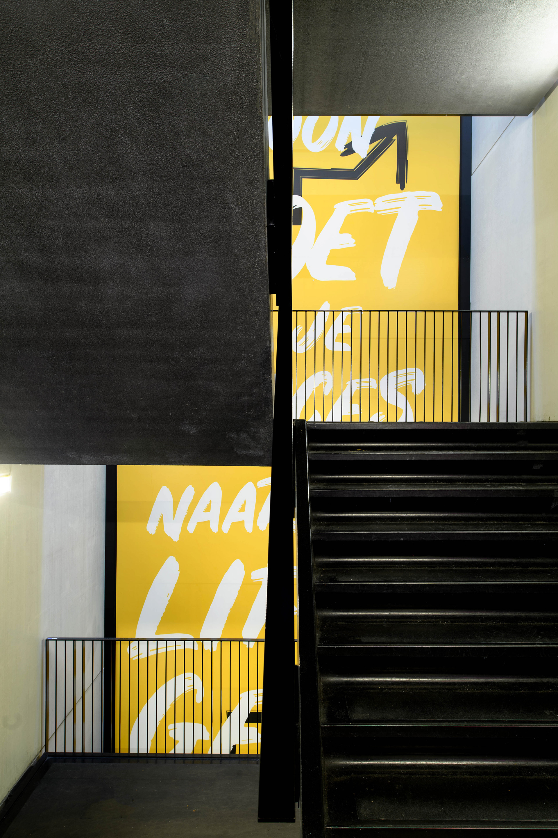
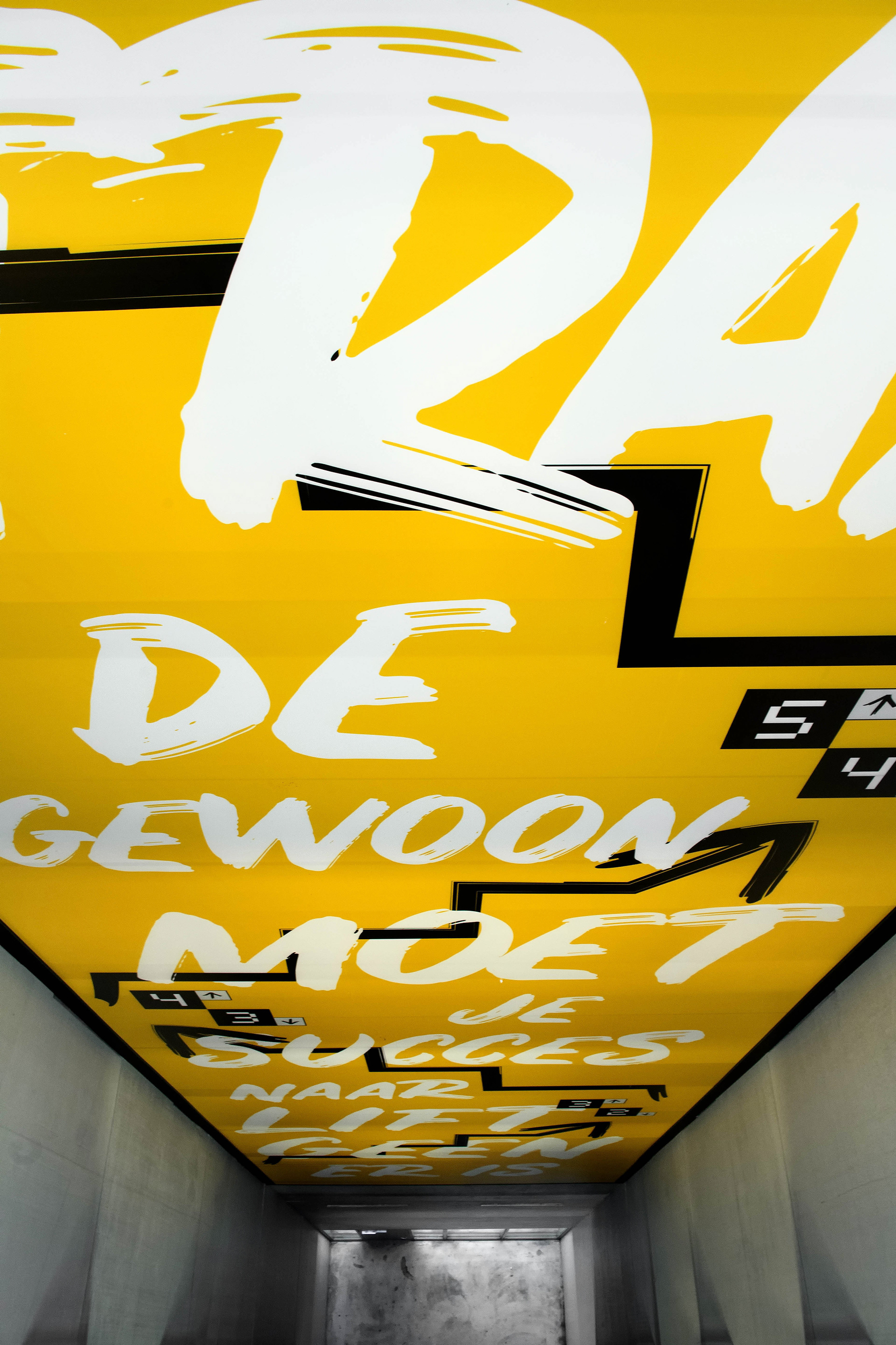
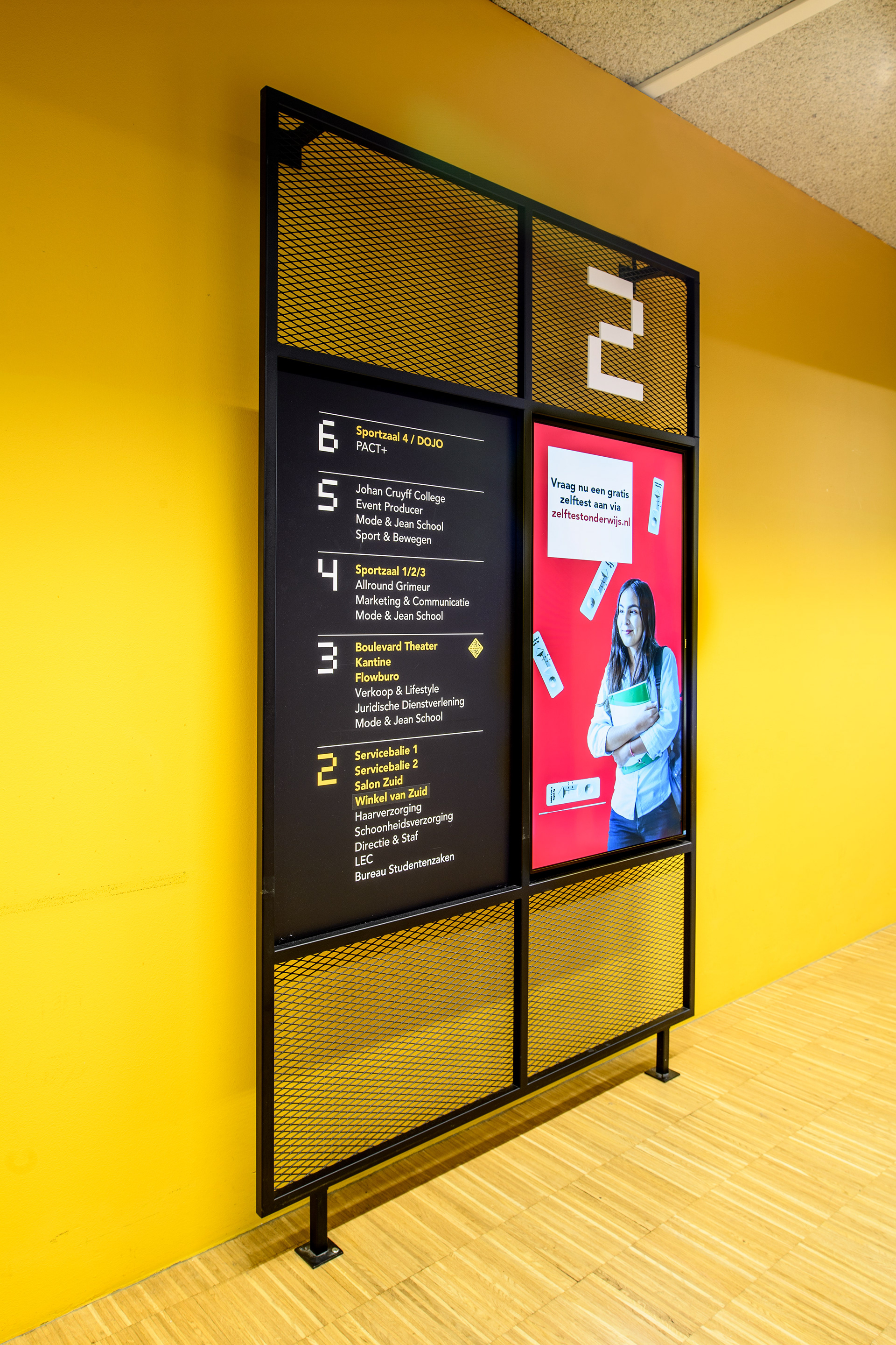
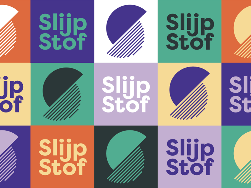
Together with Rob van Sprang of VEVS, we chose a younger, more informal and above all clearer way of communicating to the users of this building: the students. The squared shape of the logo is the starting point for all the choices we made: the pixelated iconography, the signage and the construction of the environmental graphics. In the staircases a young “graffiti style” typography matches a bold colour combination of yellow and black.
