Focus Care Pharmaceuticals, Rebranding
Client:
Focus Care (NL).
Briefing:
Rebranding of the pharmaceutical company, keeping a link with the old branding through the use of colours and sans-serif in the typography.
Creative fields:
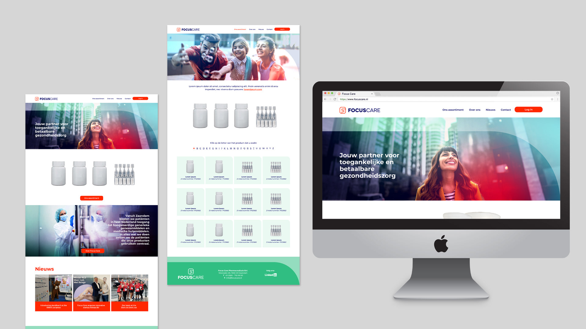
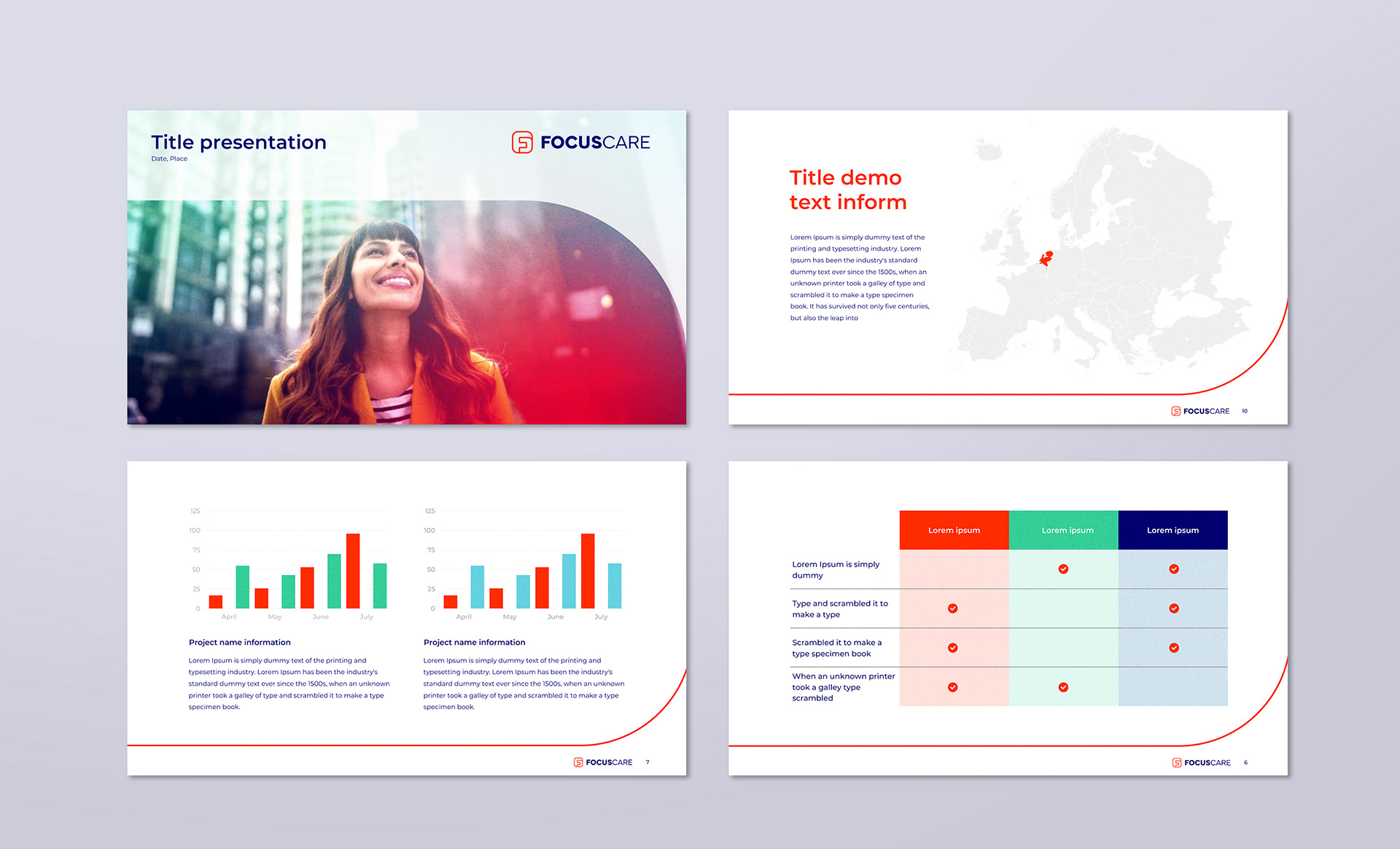
Logo and corporate identity design. Guidelines and design of study-templates such as flyer, Powerpoint presentation, letterhead and website.
--------
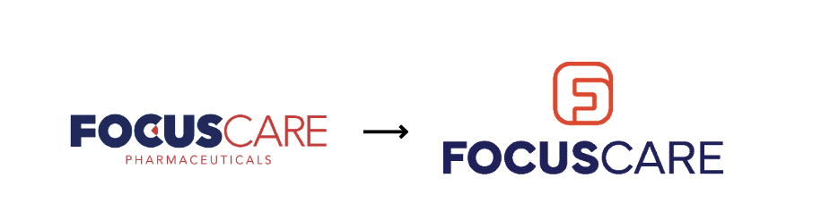
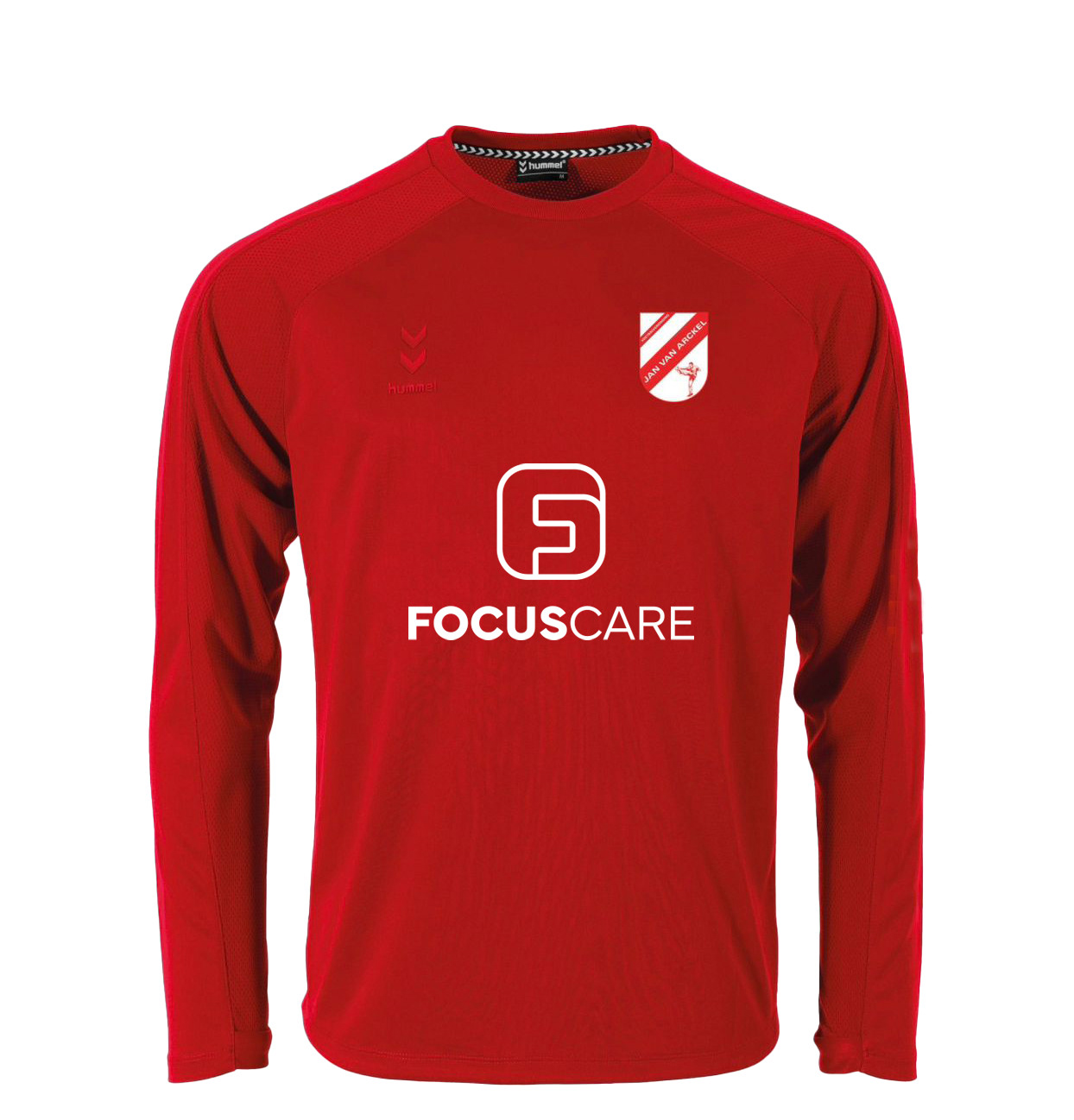
Focus Care is a pharmaceutical company distributing inhalers and products to relieve congestions and allergies. After 20 years from its foundation, the company asked for a rebranding, keeping the same colour palette as a reminder of the roots
(the combination red+blue also present in the Dutch flag) and the sober and straightforward look&feel (also representative of the Dutch culture).
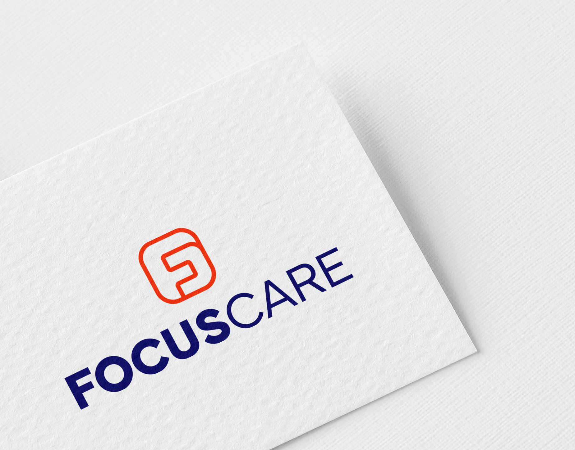
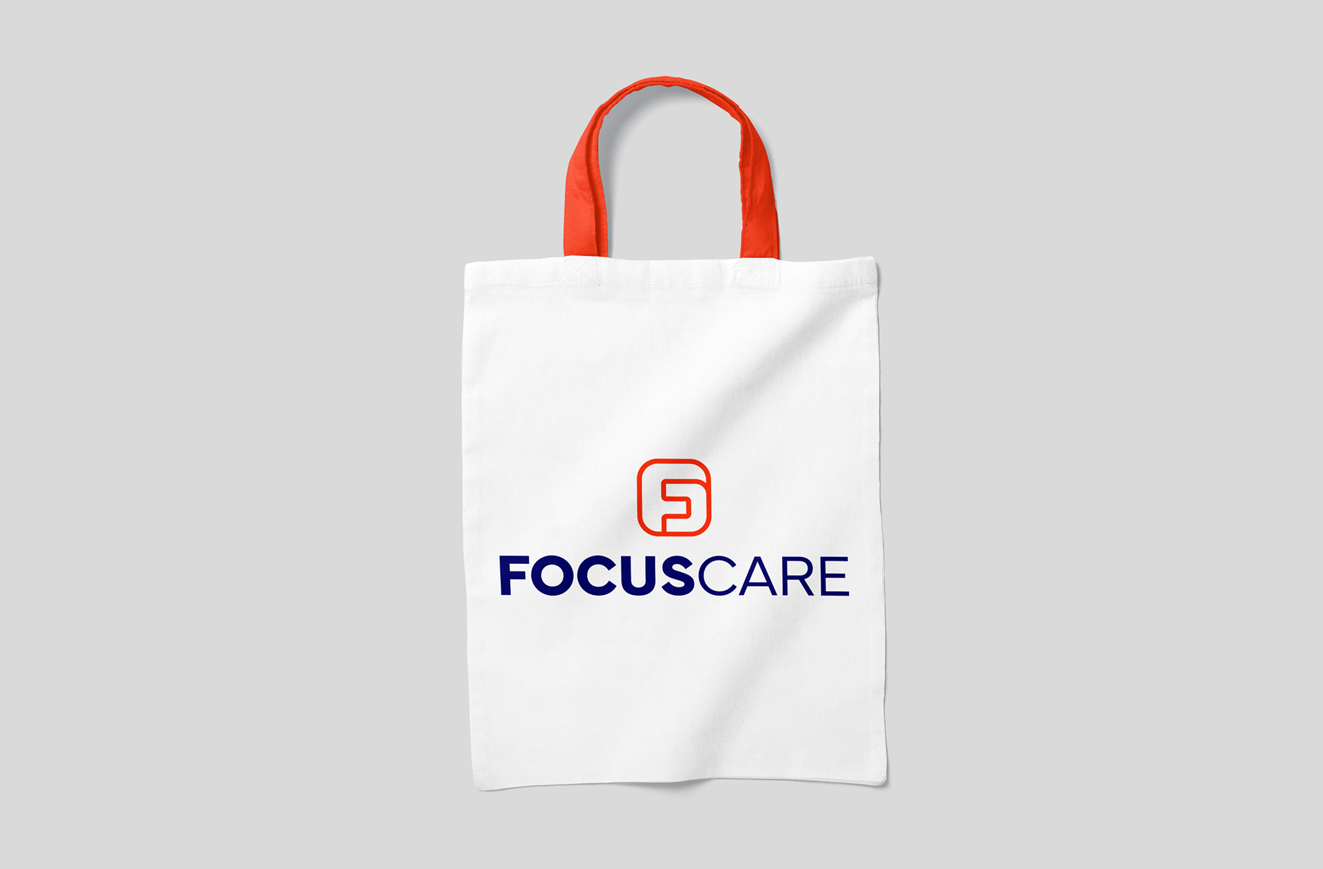
The icon is a result of the idea of co-operation and synergy, where the letters “F” and “C” exist only if they are together.
The icon is a result of the idea of co-operation and synergy, where the letters “F” and “C” exist only if they are together.